

Chegg SEO Pages
Marketing pages that improved Chegg Tutors rank by 5 ranks in Google’s search results pages. Share of search increased by 30% MoM.
— Background —
On August 1, 2018, Google had an updated search algorithm that the SEO community coined as EAT. An acronym for Expertise, Authoritativeness, and Trustworthiness—values that they use to make judgments on a page. Because of this change, Chegg Tutor's Marketing Pages, rank 6 in search results was moved to the 2nd page, rank 11— which people rarely visit. As a result, Chegg Tutor’s traffic declined which lead to a significant decrease in conversion.

— Product Design Process —
Understand the problem 👩🏻💻
Investigate how we can improve search ranking in Google.
4. Ideation 👩🏻🎨
Explore prototypes of the solution/s.
2. Hypothesis ✍🏻
Formulate design solutions to increase search ranking.
5. Usability and Multivariate AB Testing 👩🏻🔬
Test usability of prototypes with users internally and revise as needed. A/B test new elements in production and observe ranking changes.
3. Constraints 🖼
Define solutions that are feasible based on Chegg’s resources and customer needs.
6. Launch 🚀
Fully launch the solution and think about opportunities to improve.
— Understanding The Problem —
How does Google rank pages?
What’s the competition?
Why did Chegg fail?
How can Chegg improve?
>
How does Google rank pages?
Google combines AI and Human Page Raters to rate pages using Page Quality Guidelines. The guidelines show how to rate a page based on User Intent, Content Quality, Reputation, Safety, and Usability.
Source: https://static.googleusercontent.com/media/guidelines.raterhub.com/en//searchqualityevaluatorguidelines.pdf
>>
What's the competition?
Tutor.com is ranked #1 because it's well known to have the best tutors in the industry.
Care.com is ranked #2 because its website is easy to use. Users can look for a tutor based on price and location. It also promotes customers’ safety.
>>>
Why did Chegg fail?
I critiqued based on User Intent, Content Quality, Reputation, Safety, and Usability.
There were a couple of violations based on the guidelines. First, It hasn't established its reputation in the tutoring industry yet. Chegg's website doesn't show how the product works. Because of its layout, it's hard to understand how to find a tutor on the page. When you click the "Find a tutor" it's a 3 step process before you find a tutor. The binary rating system isn't an accurate review of the tutor’s performance. You can't make an accurate review if it's just a thumbs up and down.
>>>>
How can Chegg improve?
Improve pages based on Content Quality, Safety, and Usability to increase ranking.
— Hypothesis —
How might we improve the content quality, safety, and usability of pages?

— Constraints —
Target launch in 4 months
2. Limited time to change the copy
3. Adaptive Web (3 screens)
4. 5 Engineers in India
— UI Critique —
#11 Rank Chegg Tutors

1. Image takes up significant web estate but doesn’t justify what the product does.
Products need to be presented well in images, especially if it takes up a significant web estate above the fold. Because, at this stage, users decide fast on whether they should continue to engage or not.
The girl in the web call doesn’t give us a clear indicator that she’s a tutor—which is a relevant part of the tutoring experience. It also fails to communicate the tools that make Chegg’s product unique. I. e. Whiteboard, drawing and, communication tools
2. Readability issues
The font styles, weight, and color make it hard to read against the busy background image.
3. How to find a tutor?
It is crucial to communicate how the product works so that users can engage efficiently. Users want to know what they are doing. If we don’t convey what interaction the button/interface does, users get surprised and think that the product is misleading and not credible.
When “Find me a tutor” is selected, it’s a 3 step process. There’s nowhere on the page that shows this process which could cause confusion and make it hard for users to navigate the page.
4. List format is long and clunky
The list format is long and clunky. It wouldn't help users look closely at every tutor. A more focused view is needed for users to look for a tutor that would match their needs.
5. Complicated and confusing filter options
Filters are a good tool for efficient searching but, filter preferences should be clear. Having multiple options that are similar to each other only confuses users and can make their search less-accurate.
On this page, it’s hard to tell the difference between Ready-to-teach-now and Online states. According to the team, the definition is that tutors are not always Ready-to-teach when they are Online. A tooltip indicating this difference would have been helpful.
Another thing that is confusing is the search boxes. When I entered subject queries on the Keyword Search Box, it still shows a list of tutors teaching the subject and vise versa. When there’s no difference in how the Search Boxes function, there is no use separating these options. Consolidating the search boxes would make it easier for users to use them.
6. Binary Rating System
It is difficult to rate a 30+ minute tutoring service in a binary way. What if users are neutral about the experience? A vast option in rating would make it easier for users to rate and, it would enforce a more accurate rating for tutors.
A 5-star rating system has more options for users to rate with and is widely-used.
7. Safety Features
Chegg’s competitor, Care.com, promotes their tutor screening process to show that student’s safety is a priority. At Chegg, there is a similar screening process and, showcasing it would level them with their competitors.
— Feature Exploration —
1. Communicate how to find a tutor
2. Put tutors on the forefront
3. Fix all readability issues
4. Rethink the rating system
5. Improve the quality of content
6. Improve filters
7. Promote safety features
— Ideation —

Initial iterations of page comps
Considerations: Keep SEO copy
Above are low fidelity wireframes of the new page designs I explored. The top 3 screens have the title, meta-text, and no header background image, which took inspiration from Airbnb’s straightforward design approach. The new proposal focuses on minimal and efficient searching, which initiated removing the header image, optimized filter options, and tutor layouts. The tutor layouts were explored in Carousel, List, and Grid layouts.
The concern with the top 3 layouts was that it is a big difference from other Chegg pages, which made the bottom 3 more ideal options for brand cohesiveness. The grid layout won because it recognized the need for students to focus on the tutors and have more options. These options are experiments and, later testing would validate its effectiveness in usability.

Old Layout

New Layout
High fidelity prototypes of features and new branding treatments
In order to communicate the new solutions to stakeholders, high-fidelity images needed to be produced. In the new prototype, the following elements are shown:
How it works banner - To tell students/parents how finding a tutor works, which would make it easier for them to navigate the page.
Vector treatment of header image - To make Title and Meta Text more visible and explore the new branding colors.
Value proposition icons - A way to instill trust in students/parents by communicating the benefits and quality of using the product.
Verified tutor's badge and tooltip - Promote the screening process in recruiting tutors to ensure the safety of students when engaging with tutors.
Card grid layout - A means to get students to experience less information fatigue and focus on tutor’s specifications
Star rating - To be able to give a more accurate and fair rating of the tutoring service, allowing more neutral ratings compared to the binary rating system.
Chat icon - Easier access to picking a tutor.

Refined high fidelity
Value propositions - I changed the iconography to multi-colored vectors to make it stand out and simple to read.
Simplified search box - Simplifying the “Keywords” and “Subjects” search boxes to just one “Keywords” search box, because it functions similarly, is necessary to make it easier to use and less confusing to students.
Availability indicators - To differentiate the “Online” and “Ready to teach” when selecting filters, a visual badge accompanying those selections is added on the tutor cards.
Moved the fine print to white space - The old background fails to emphasize the pricing promotion because of the font styling and background image. Moving the font to a white background would highlight the fine print and motivate users to try the service.
Testimonial cards - Testimonial cards are added to show good customer feedback from students and show the credibility of the service.

Hybrid of the old and new design system
Old Design System Color Scheme - Used the orange color scheme of the older design system because of the delayed launch date of the new design system.
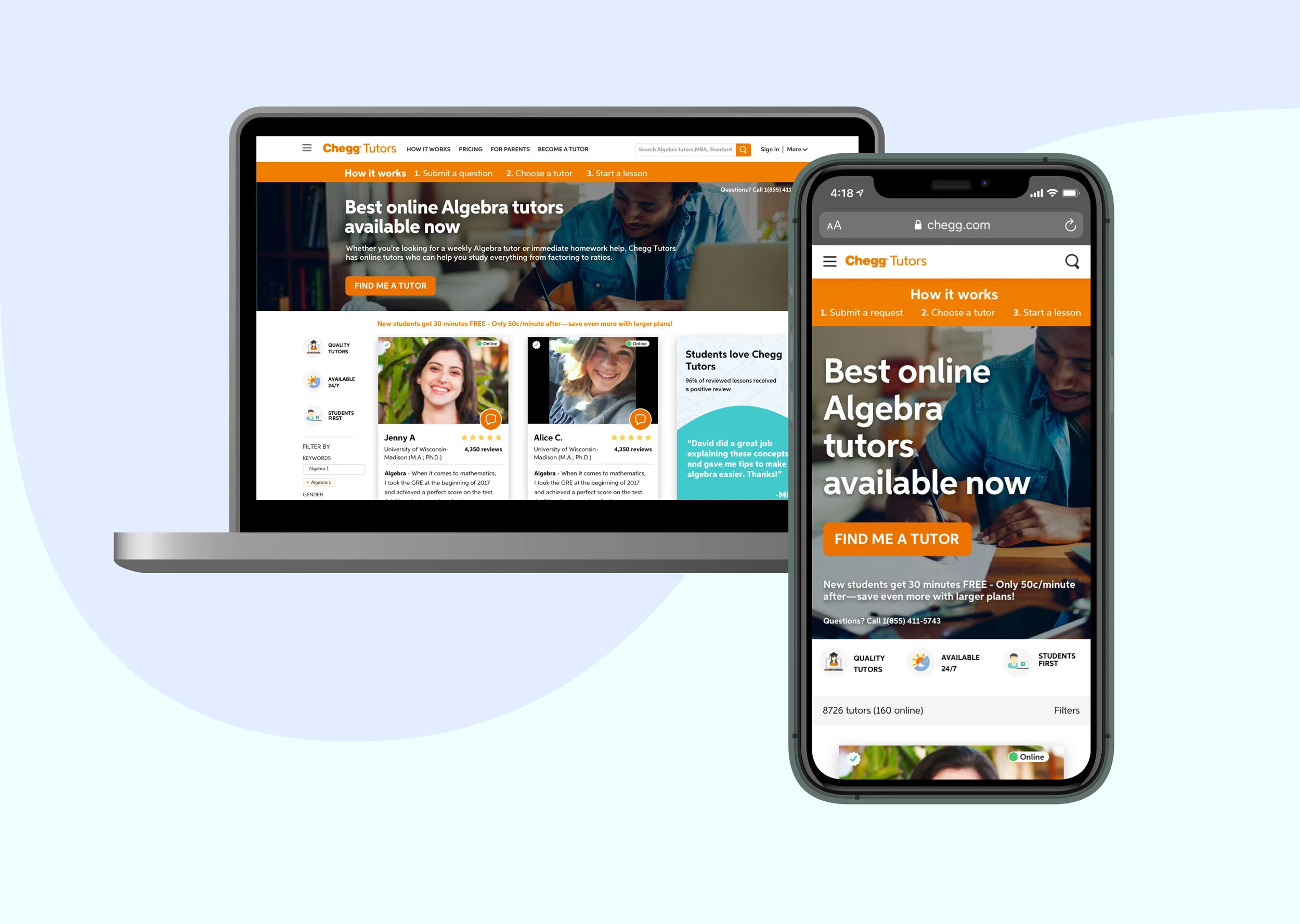
Header imaging - Reverted to realistic imaging with better imagery to align with the old design system and readability issues.

Old

New
— Mobile Views —

Filter off

Filter on
— Multivariate A/B Testing —


We ran A/b tests on different sets of features in phases to understand what impact it would make on the search ranking.
— Launch —
Before the multivariate tests, I did UXQA on the pages and, the new features are working as expected. The SEO director and I analyzed the results of the tests. The results were promising, some variations retained ranking and some improved ranking. Because of that, we decided to launch the pages fully with all the new features.
— Success —
We fully launched the pages and, we moved up from rank #11 to rank #6 in search results in January 2019. Our Share of Search increased by 30% MoM.
To see more projects from the previous website, click below.